RestaurantSupply
Redesign of the internal management interface for RestaurantSupply.
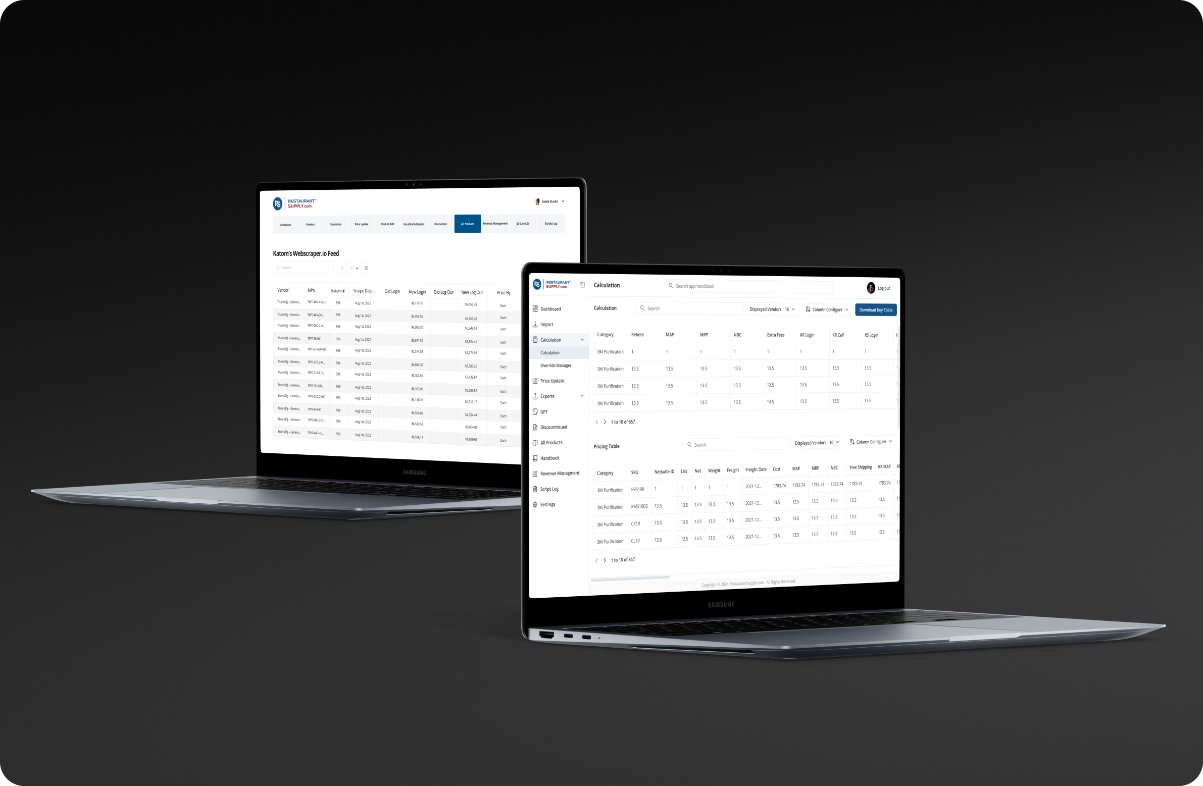
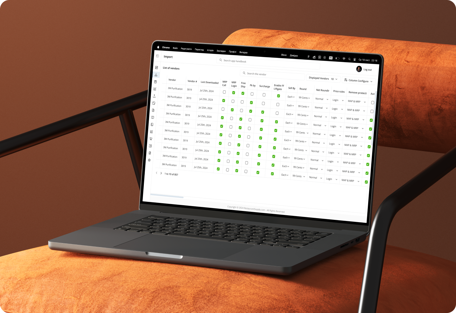
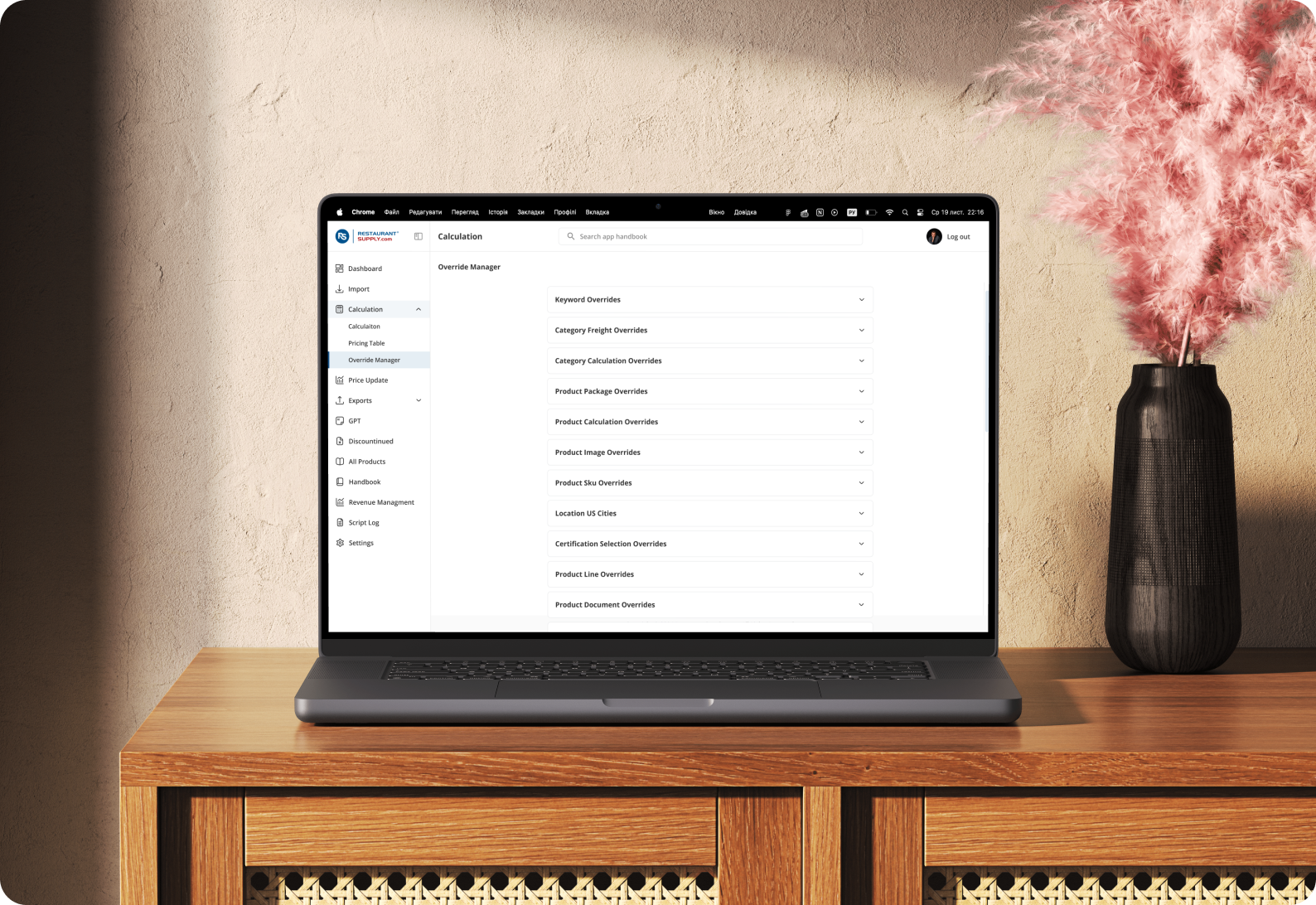
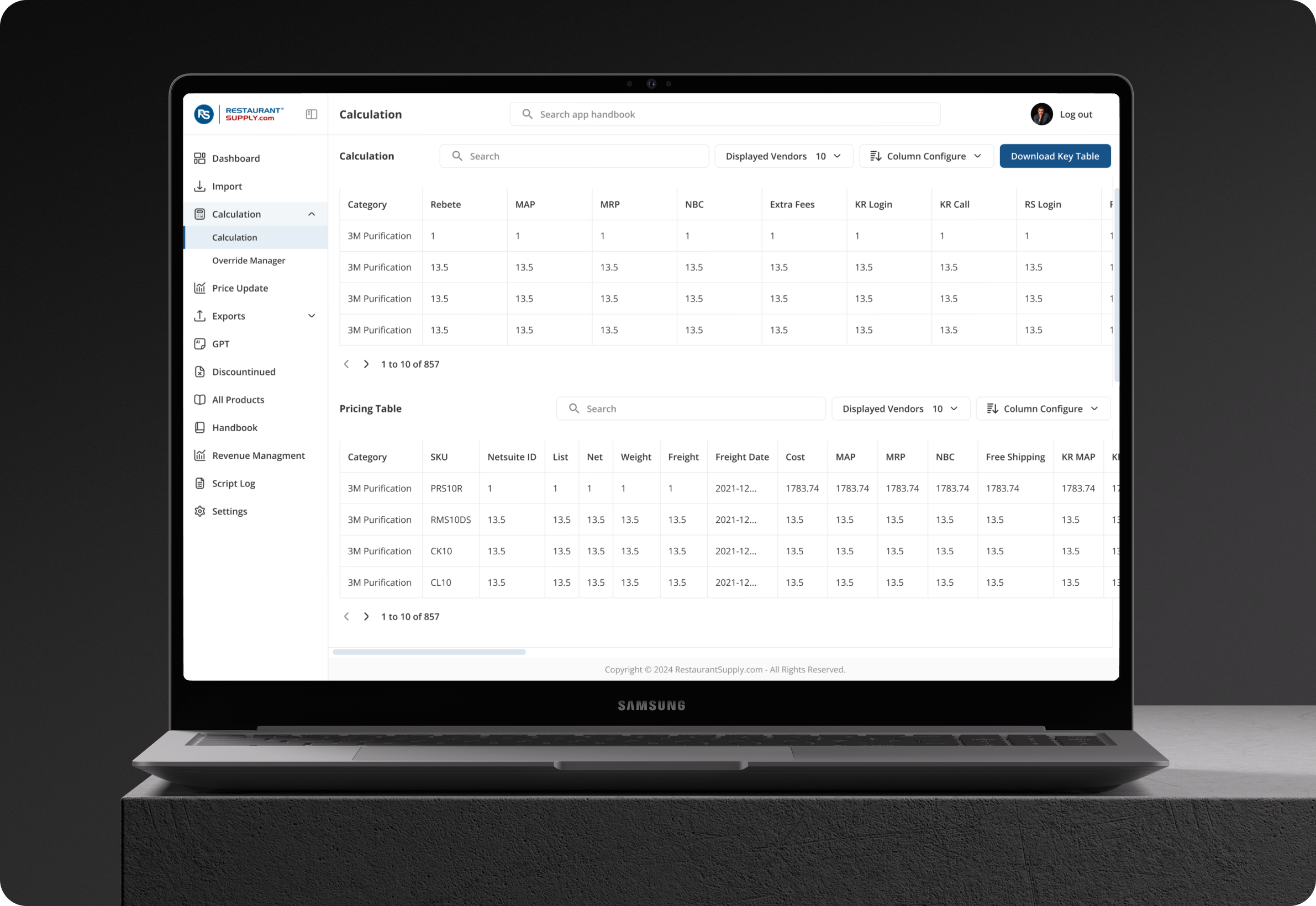
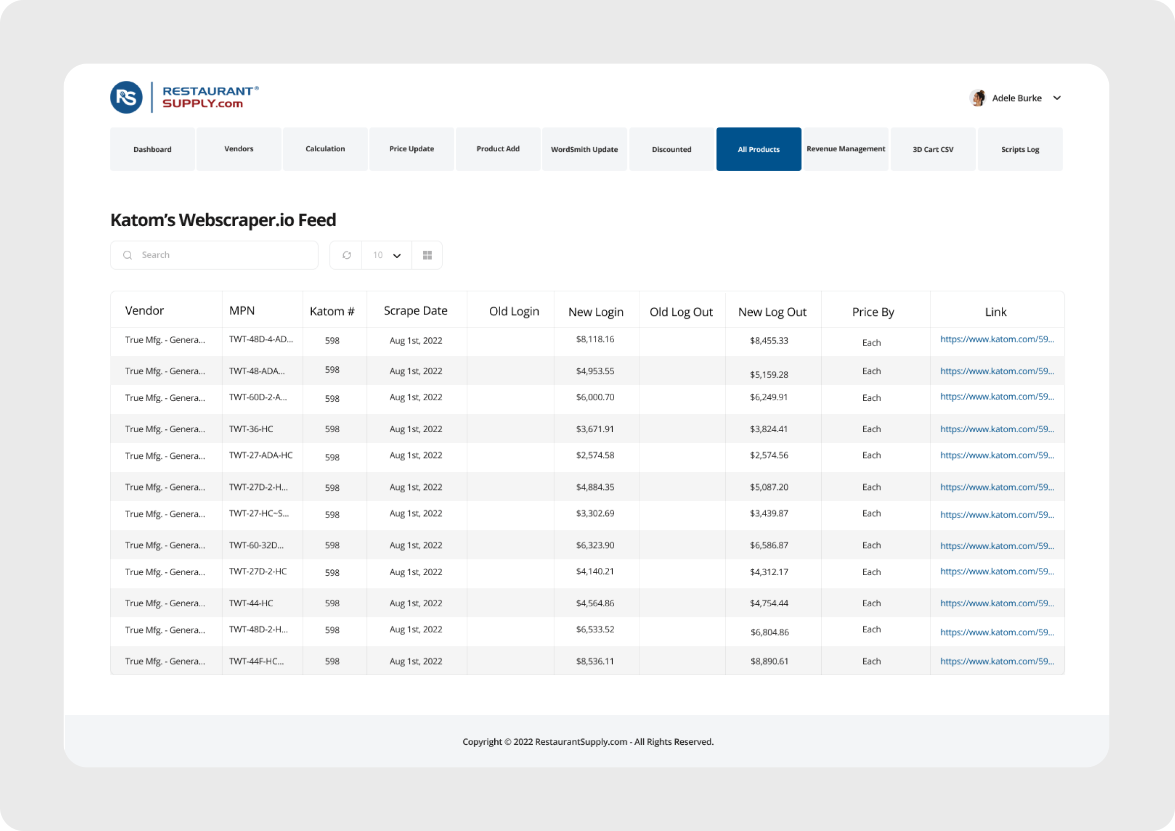
My task was to restructure and modernize several key sections of the platform that business owners use to manage their content. I focused on improving clarity, simplifying navigation, and creating a more intuitive layout to support faster daily work.
My responsibilities included
The existing interface was:
Cluttered and visually noisy
Inconsistent
Difficult to navigate
Confusing for new users
Issing clear logic in layout and hierarchy
Some elements were located randomly, key actions were hard to find, and even simple tasks required unnecessary steps.
⬇️ Key Improvements
1. Navigation Redesign
I moved the main navigation into a left-side sidebar — a more familiar and efficient pattern for management systems. This made the layout more compact and gave users quicker access to core sections.
2. Clear Top Bar Actions
Filters, search, and global actions were moved to the top bar. This created a predictable, unified structure and reduced confusion.
3. Cleaner, Less Distracting UI
The previous interface was overly colorful. I simplified the visual style and reduced unnecessary accents so users could work longer without eye fatigue.
4. Consistent Layout Structure
I reorganized elements to create clear hierarchy, spacing, and predictable patterns — making the interface more intuitive even without onboarding.